Labor of Luxury: an identity for the work behind the surface
For the Texas Fashion Collection, Argot Nots developed a bilingual exhibition visual identity across environmental, printed, and digital encounters—carrying the curator’s established thesis about skilled labor into public-facing form.
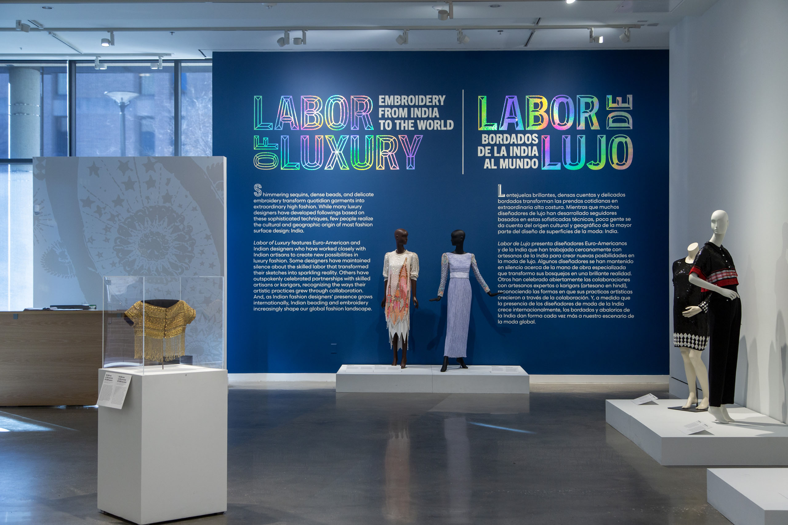
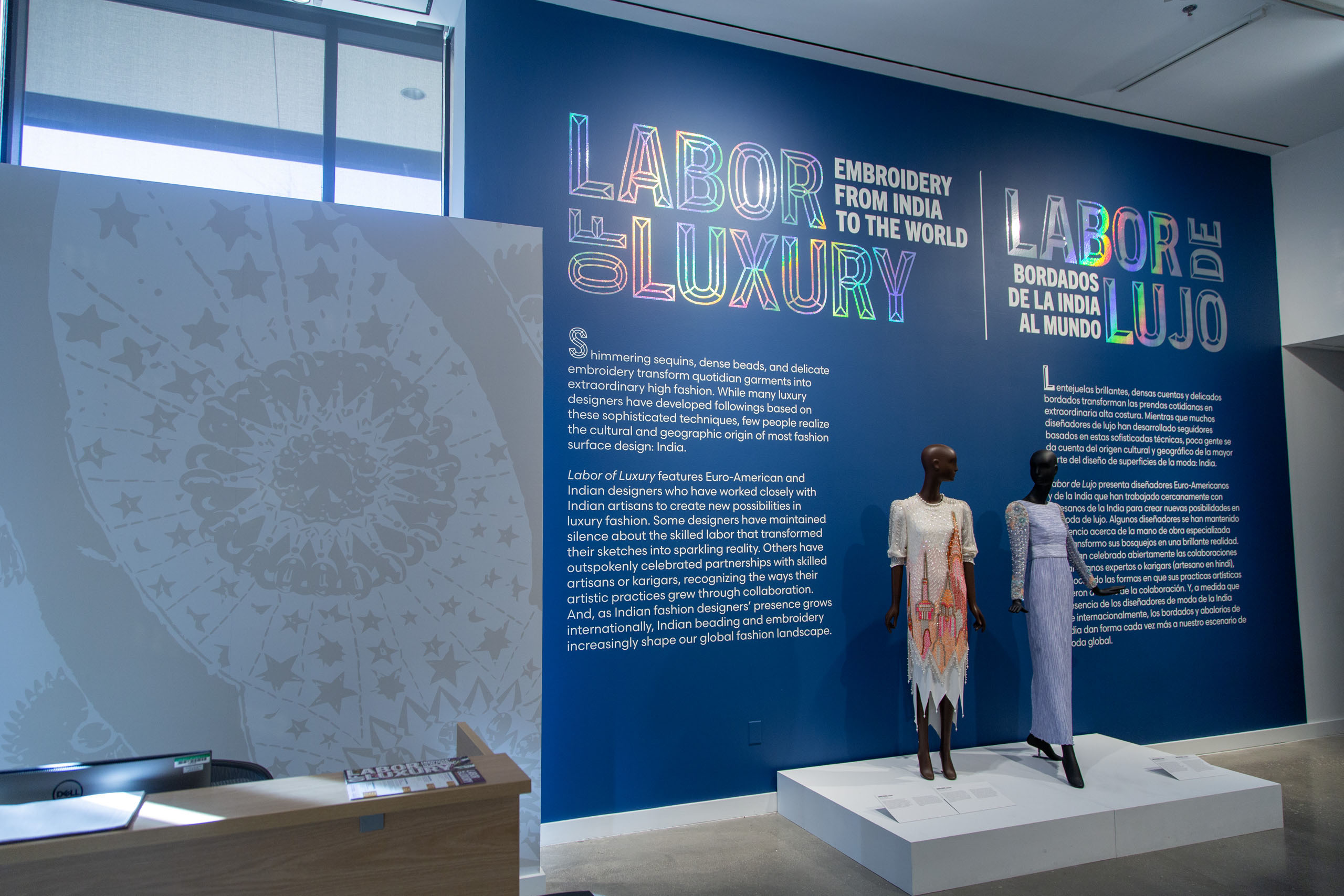
Installed title wall: deep-blue paint, holographic bilingual title, and two mannequins.
Organization
Texas Fashion Collection • Annette Becker, curator + director
Argot Nots Role
Exhibition identity + environmental, printed, and digital design
Presentation
UNT CVAD Galleries • Oct 2024–Feb 2025 • later traveled to BU
The brief was graphic. The opportunity reached across media.
Annette Becker, curator and TFC director, supplied the exhibition title, theme, objects, and label content. Argot Nots was responsible for their visual expression—not the curatorial argument, copy, content hierarchy, visitor flow, fabrication, or installation.
PRESENTING REQUEST
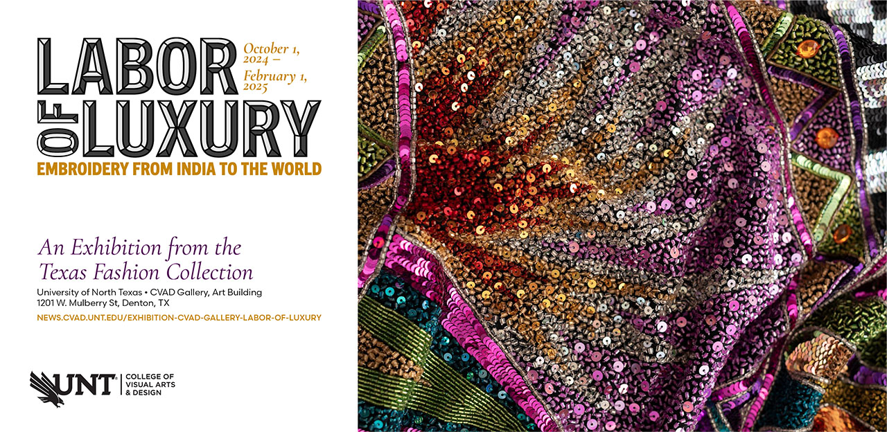
Title wall, bilingual labels, rack card, TFC guide, college media-carousel slide, and social graphics.
REQUEST → DESIGN OPPORTUNITY
Design Opportunity
Give the curator’s established argument about labor a coherent, legible identity across exhibition space, print, and digital communications.
The Inputs
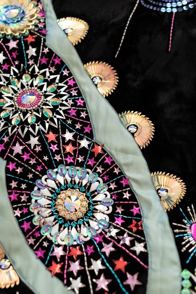
Garment detail, space, and material tests shaped the direction.
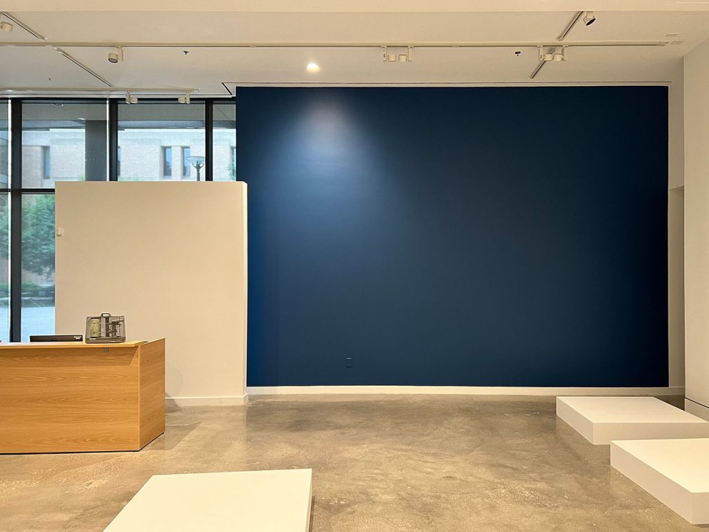
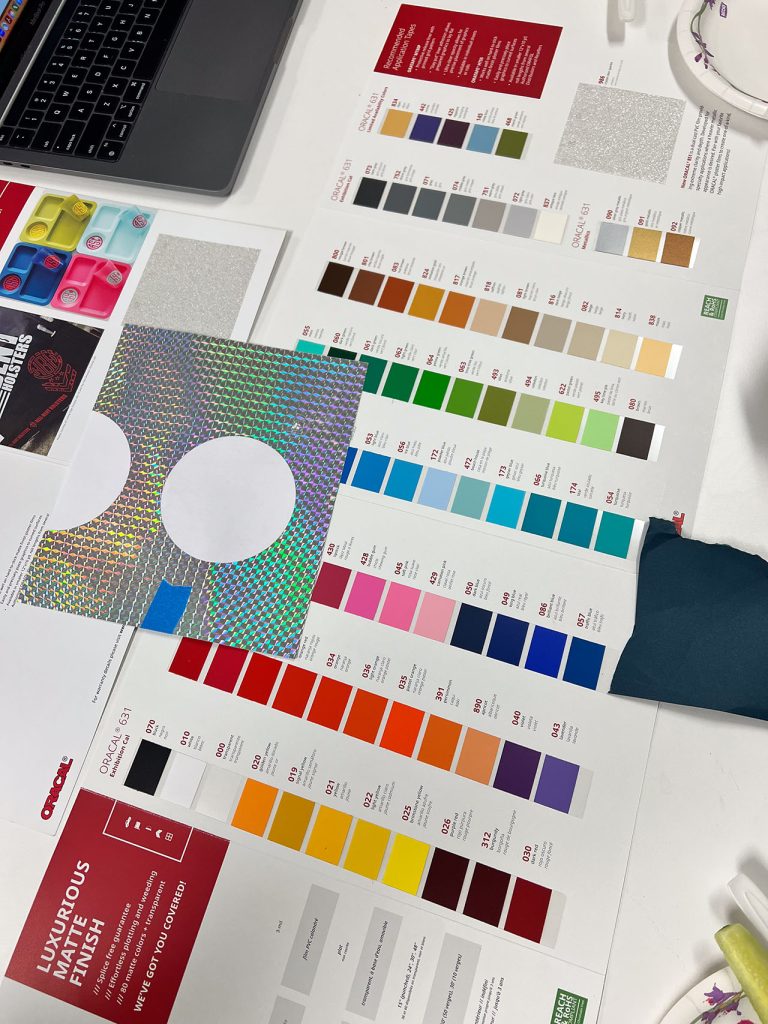
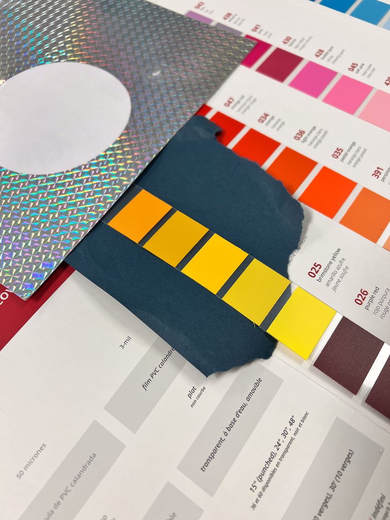
Curator-supplied garment photographs, a site visit, existing blue paint and holographic vinyl, bilingual label content, and physical color tests informed the visual system. These were design inputs—not visitor research or curatorial editing.
KNOWN CONDITIONS → exhibition-specific visual freedom • bilingual curator-supplied copy • UNT and partner-logo rules • university approval before rack-card production • project budget and schedule.
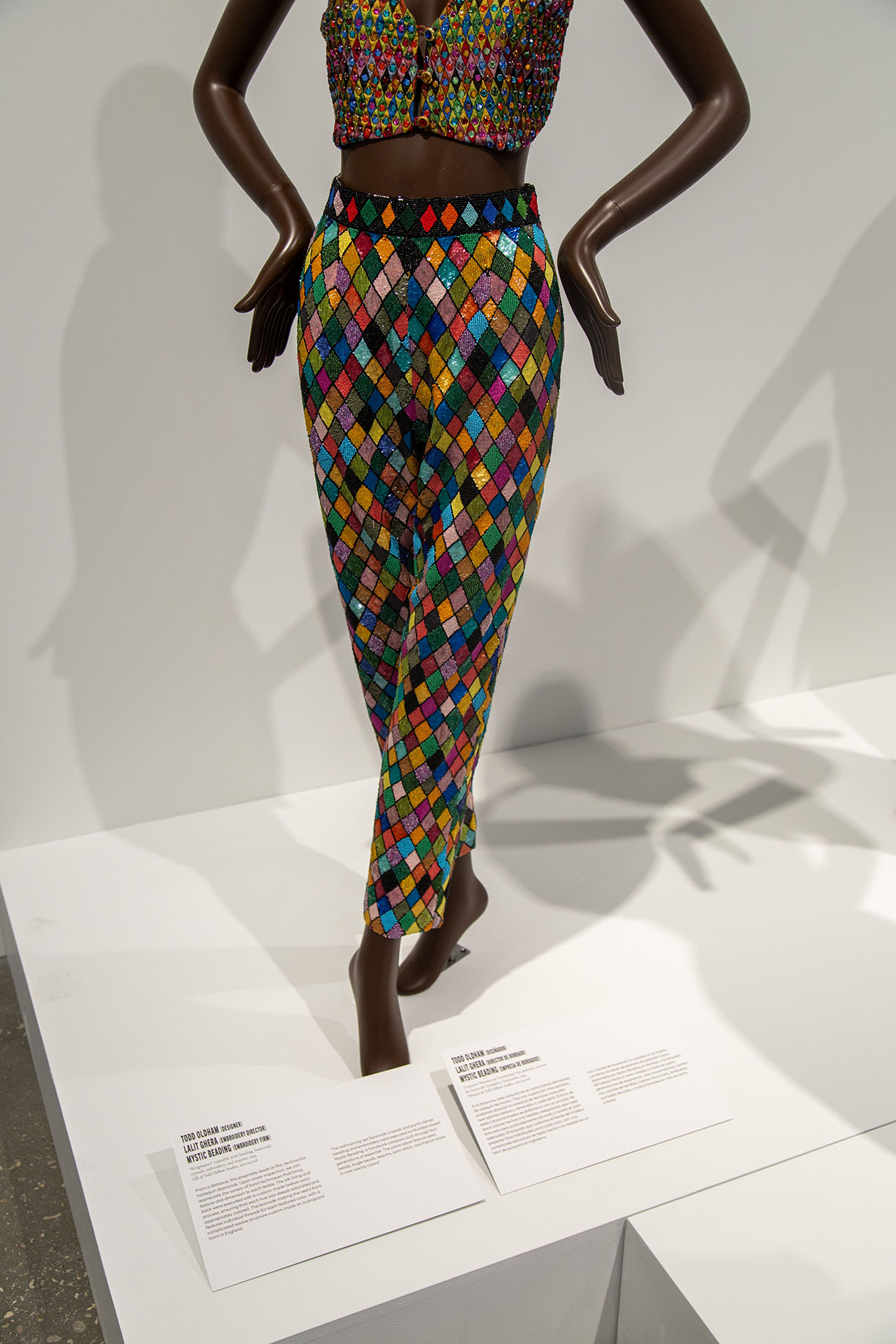
CURATOR-SUPPLIED GARMENT DETAIL
site visit • blue title wall
PROCESS • EARLY MATERIAL + COLOR STUDIES
DESIGN LOGIC
Let the surface reveal the labor.
The visual system held two qualities together: legible, restrained treatment for the curator’s bilingual information; selective iridescence, facets, and garment details where the exhibition’s craft and ornament could take visual focus. “Let the surface reveal the labor” names our working interpretation of that design logic, not a formally delivered exhibition slogan.
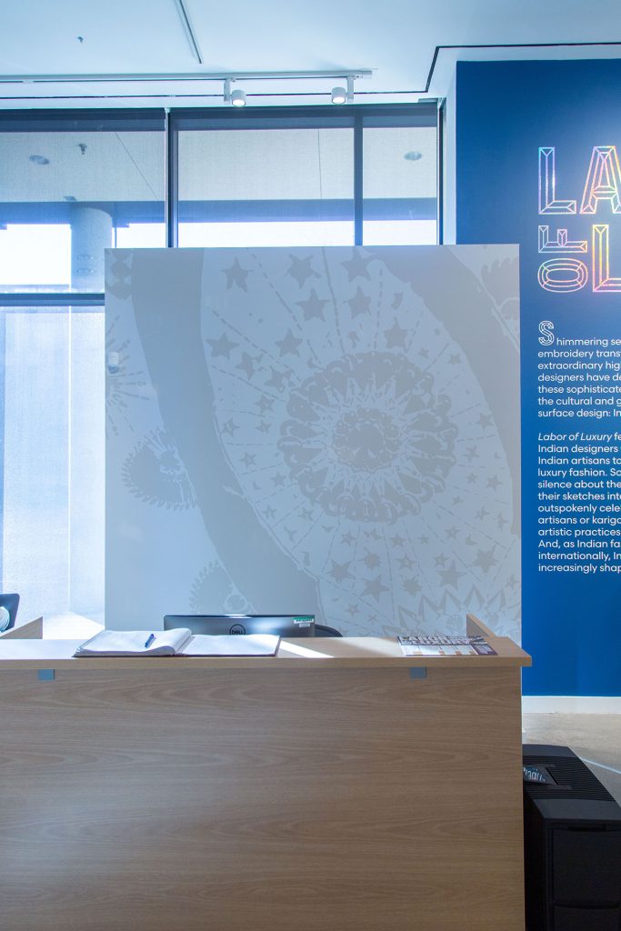
INSTALLED • GARMENT DETAIL IN A QUIETER REGISTER
Strategic decisions
Three decisions turned a title treatment into a system.
The exhibition could establish its own visual direction within standard UNT and partner-logo guidelines. Rack-card artwork also required university approval before production.
EARLY HOLOGRAPHIC + BLUE / GOLD OPTIONS
01
Build the palette from two fixed anchors.
Blue paint (#003968) and holographic title vinyl were already determined. Physical tests and curator-supplied garment images informed complementary violet (#540059) and gold (#c68606). The values were selected to carry across print and digital output.
WHY IT MATTERED → The palette connected fixed spatial elements to the exhibited objects and other media.
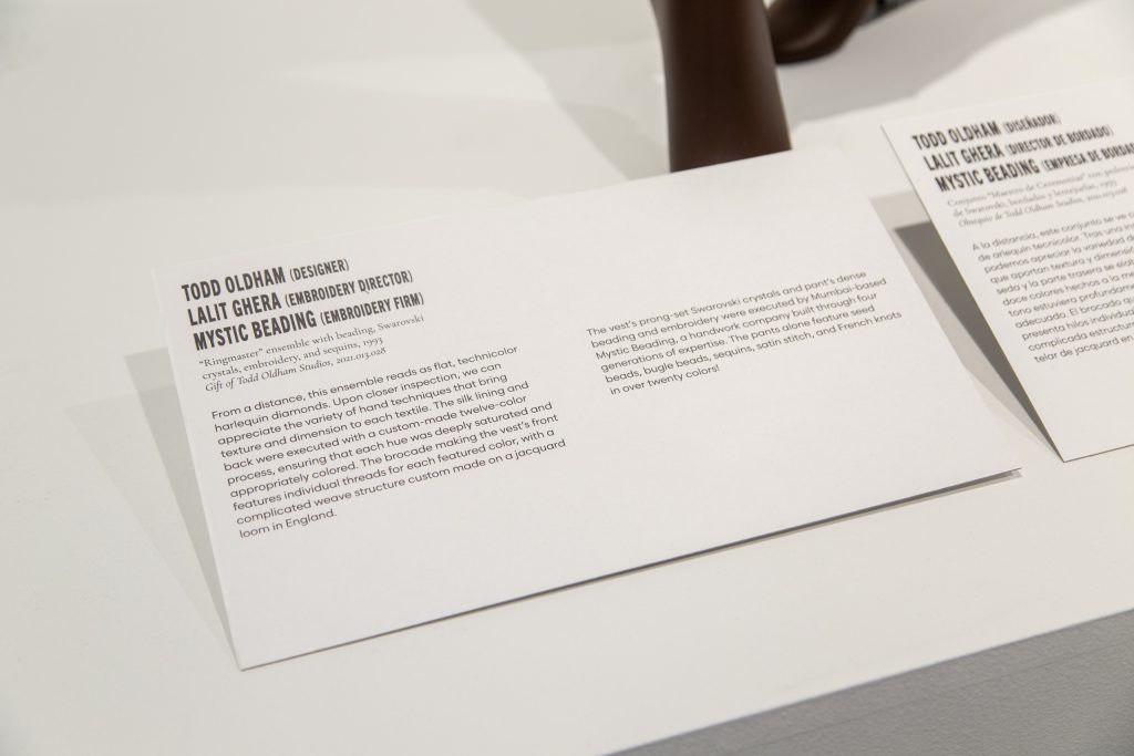
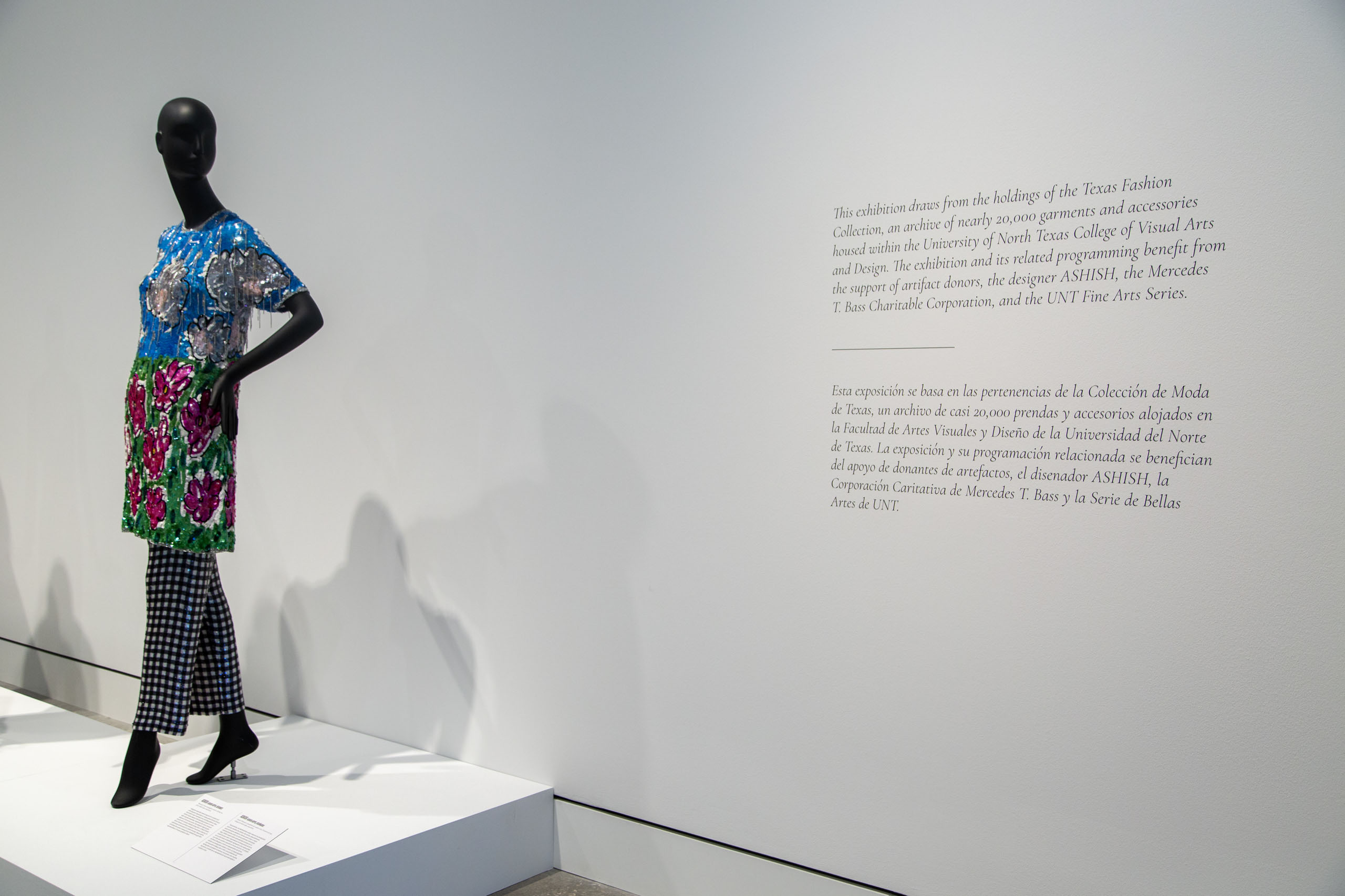
INSTALLED BILINGUAL LABEL DETAIL
02
Let restraint carry the information.
Scandia’s high x-height and open counters supported small or distant reading. Cormorant Garamond italic gave sponsor and acknowledgement information a more traditional register. Bold, all-caps faceted Trade Gothic made the title expressive and gave English and Spanish visibly distinct treatments.
WHY IT MATTERED → Clarity and ornament could coexist without competing.
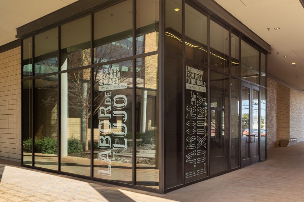
INSTALLED COURTYARD-FACING WINDOW VINYL
03
Extend the identity beyond the title wall.
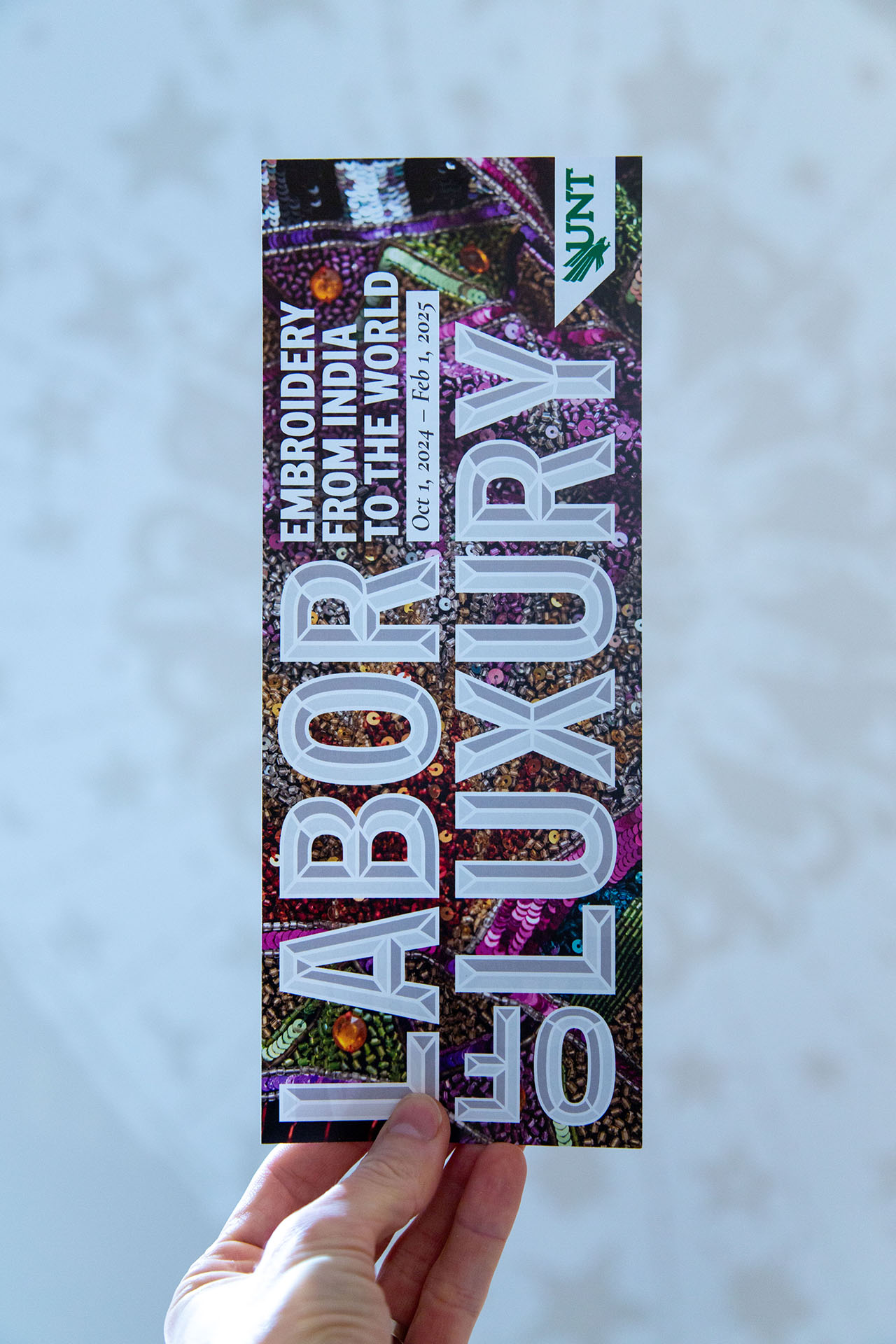
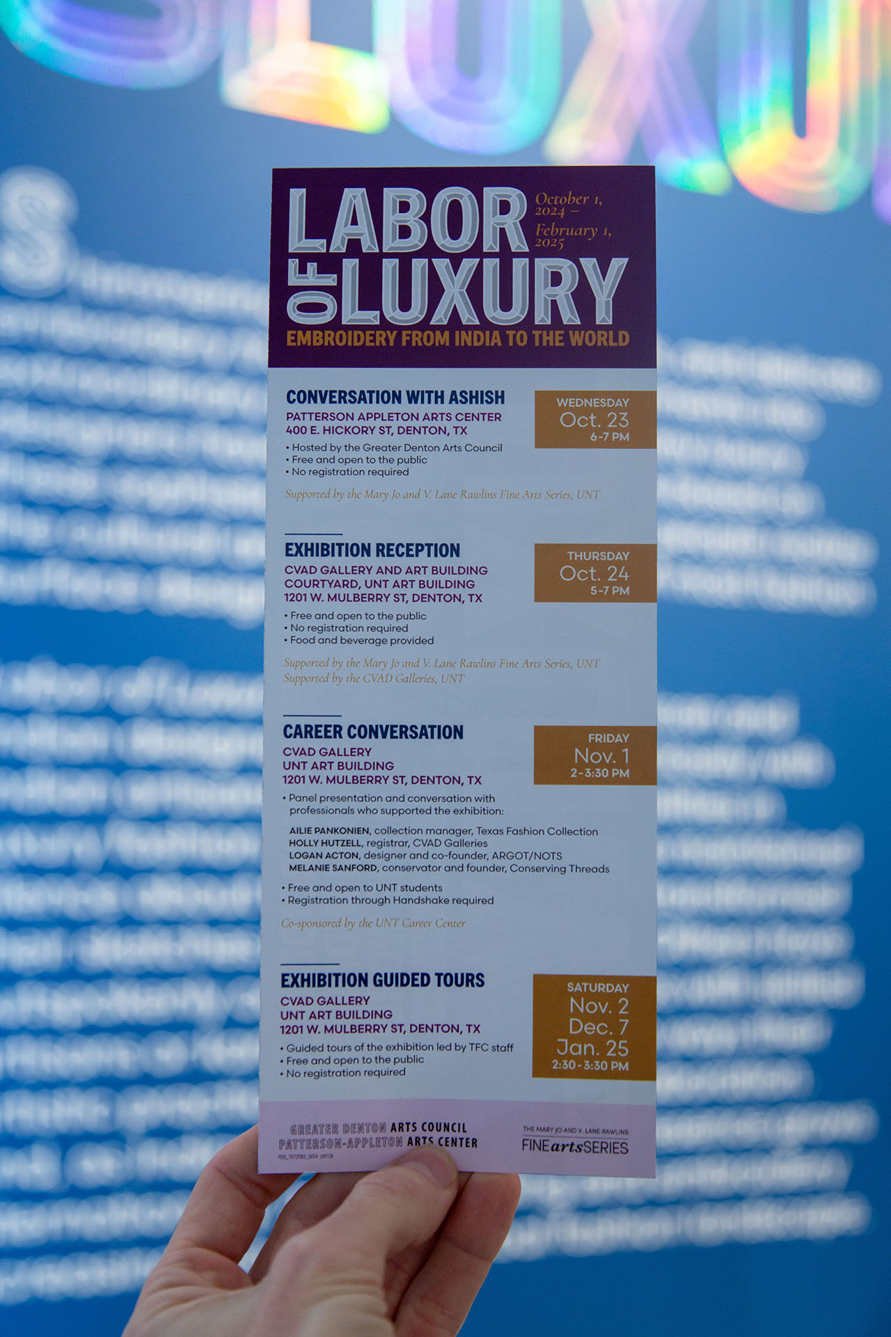
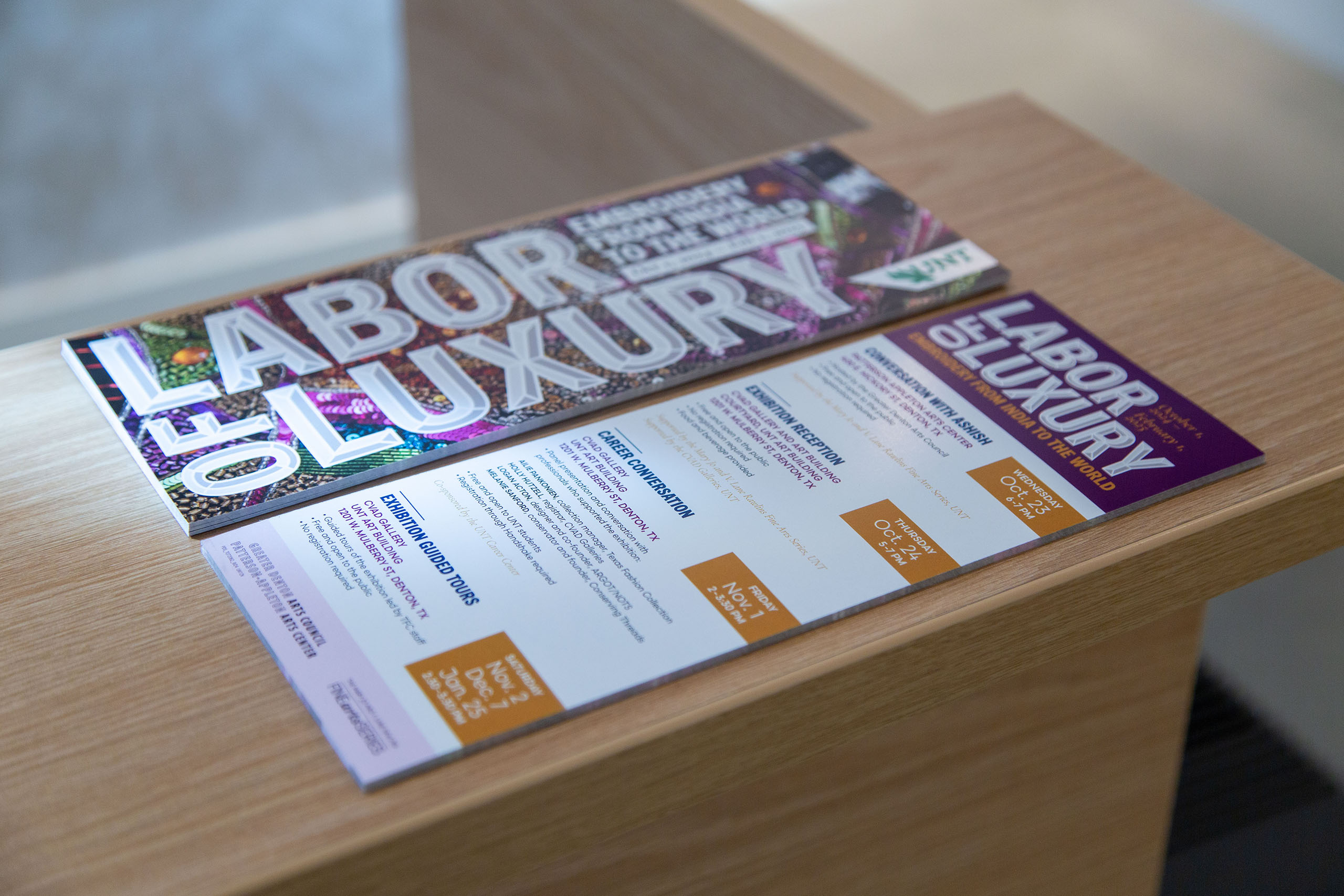
Courtyard window vinyl carried the bilingual title outward, intended to make the gallery more visible from the courtyard and nearby buildings; a pale garment-detail graphic quietly filled the wall behind reception. A half-letter rack card echoed the windows and mannequins while using standard cardstock efficiently. Labels, acknowledgements, campus media, and social graphics completed the set.
WHY IT MATTERED → Format, hierarchy, and material choices served distinct encounters without changing the exhibition’s curatorial content.
THE SYSTEM IN PRACTICE
One visual language, many points of encounter.
The installed system stayed coherent without making every application identical: color, type, proportion, and selective surface detail shifted as viewing distance, information density, and medium changed.
Gallery photography and printed cards document the physical work. The carousel image is supplied digital artwork; social graphics were designed but are not shown as photographed placements.
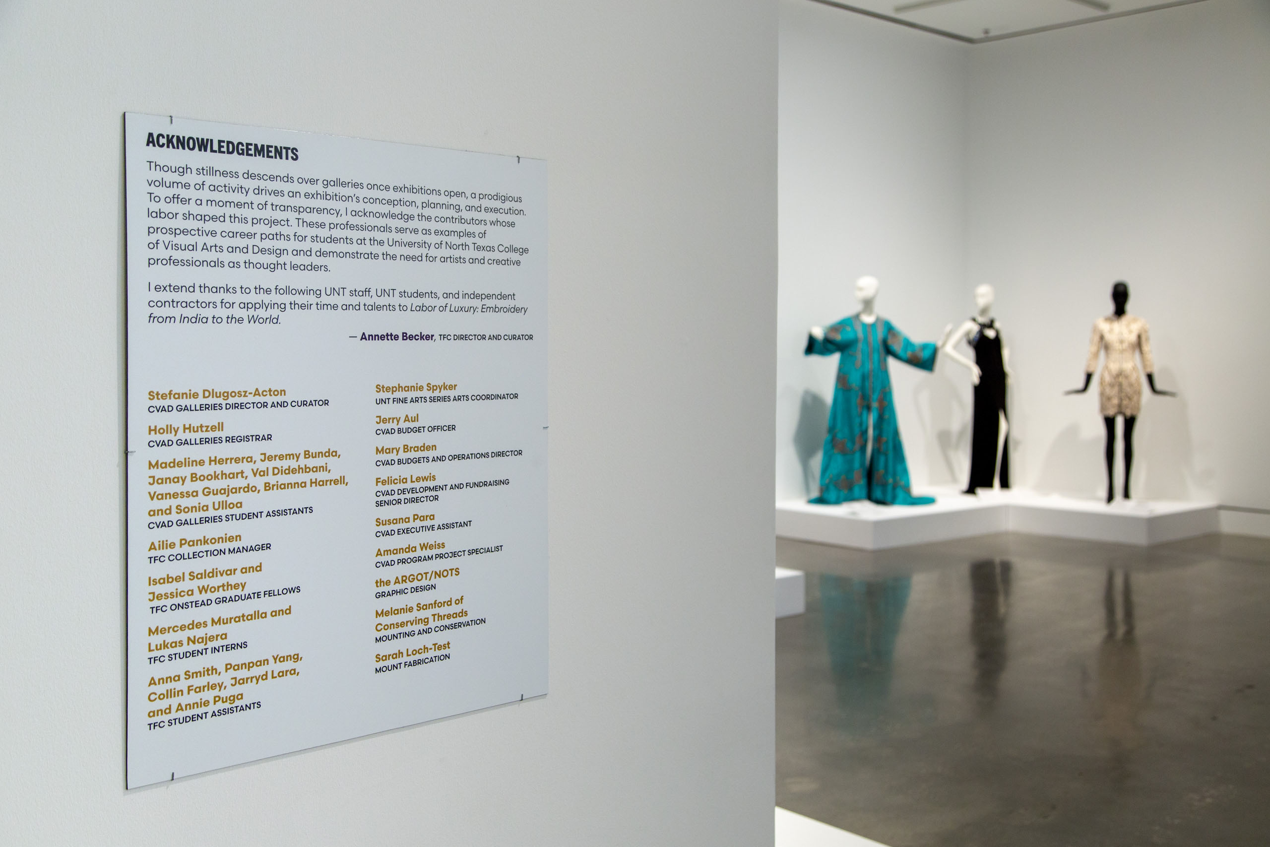
The installed acknowledgement graphics recognized preparators, students, staff, and supporters, in keeping with Annette Becker’s emphasis on labor beyond the garments.
DOCUMENTED OUTCOMES
What the design delivered.
Installation photographs verify the gallery graphics, bilingual labels, windows, acknowledgements, and printed rack card. The completed files extend the same identity into college media and social graphics. Argot Nots delivered within the project’s budget and schedule; the exhibition later traveled to Boston University, where designs were adapted to its gallery space.
Installed
A gallery-scale identity
Title wall, front-desk graphic wall, bilingual labels, window vinyl, and acknowledgements.
Extended
Print and digital applications
Physical rack cards, college carousel artwork, and social graphics.
Adapted
A second gallery context
The exhibition later traveled to Boston University, and Argot Nots adapted its original graphics for that space.
CLOSING OBSERVATION + CREDITS
A curatorial argument, given a visual register.
The curator’s thesis and label content did not need rewriting. This project shows a more specific contribution: a visual identity can carry a knowledge-rich argument across a courtyard, an exhibition room, a small printed card, and digital formats while keeping the curator’s authorship intact. The installed and printed artifacts show the work; visitor response remains a different question.
PROJECT CREDITS
Argot Nots: exhibition visual identity + graphic design • Curator: Annette Becker • Client: Texas Fashion Collection • Presented by UNT CVAD Galleries; later adapted for Boston University
See how Argot Nots turns complex material into usable form.
A STORY THAT NEEDS TO TRAVEL?
Let’s give complex material a coherent visual form.
If an exhibition, program, or body of specialist knowledge needs to work across space, print, and digital, let’s talk about the argument you need people to encounter and the formats it must serve.